Monday, April 13, 2009
Thursday, March 19, 2009
CHRIS WARE!!! - unofficial (acmenoveltyarchive.org)
Chip Kidd (goodisdead.com)
Wednesday, March 4, 2009
Monday, February 23, 2009
Monday, February 16, 2009
Saturday, February 14, 2009
Friday, February 13, 2009
Wednesday, February 11, 2009
Monday, February 9, 2009
Tuesday, February 3, 2009
Monday, February 2, 2009
Sunday, February 1, 2009
CREATURE
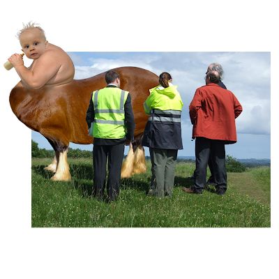
WEEKEND PROJECT: Objective is to use multiple ways of creating selections, manipulating those selections with basic tools and layer effects to create a creature. Use multiple images (minimum of three) and multiple layers to create this creature with shading and form. The psd that will be comressed as a zip and placed into the appropriate folder on the server should have no more than 3 layers (merge layers if necessary), minimum of 3 paths. The end file should be RGB, 800px x 800px, 72 dpi/ppi. The file should have a transparent background. Name the psd like so:
Wednesday, January 28, 2009
Millennium Falcon destroyed by the Evil Metz Hall
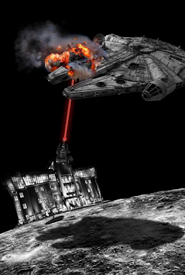
Rundown:
-Background is jpeg of the moon with the top black portion extended and filled in with eye dropper/paint bucket to match space (grayscale)
-Millennium Falcon is jpeg with background erased, cut and pasted on new layer (grayscale)
-Shadow is copy of Falcon with curve adjusted to create solid black shape, shape transformed to appear flat on lunar surface, opacity adjusted to show surface, edges blurred to appear like a shadow
-Metz hall is cut and pasted from path from pic and liquefied in parts to conform to curve of lunar surface (grayscale)
-Changed mode to RGB for explosion and laser
-Gun is jpeg of some weird laser gun, background erased cut and pasted
-Laser is pen tool (red) with inner and out glow
-Explosion is jpeg with outside erased and edges erased to conform to Falcon along with clone stamp tool to fill space
-All images contrast and brightness adjusted manipulated for cohesion
My Gigantic Nephew (life size)
This is a picture of my nephew (hilarious) as the star of a Mystery Science Theater 3000 feature.
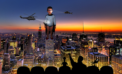
Rundown:
-Created a path around my nephew
-Cut and pasted the pic on a new layer of cityscape pic
-Adjusted the hue, brightness and contrast of nephew to appear part of the cityscape
-Pics of Helicopters from other photoshop window with background magic erased cut and pasted on new layer (adjusted contrast to appear part of photo)
-Pic of MST3K dudes from other photoshop window, background magic erased & outer glow selected to more clearly define shape with color matched to photo
-Shape drawn with pen tool to indicate helicopter spot light, shape outer and inner glowed and slightly erased to blend with face all on new layer
-Face and Shirt brightened with dodge tool to appear as if blasted with light
Tuesday, January 27, 2009
Slick Willie
This was my attempt to parody the Uber cool Shepard Fairey (amazing artist) Barack Obama poster. It’s a bit weak I’d say, but hey, I’m learning. Can you guess who it is?......Ole “Slick Willie” – Memphis Mayor Herenton
The run down: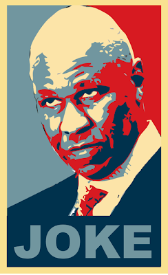
-Found a decent pic of Slick Willie on google images
-Dragged it to desktop
-Dragged the jpeg to the photoshop icon
-Cropped the photo so it was proportionate to the original poster which is also open in another photoshop window for reference a color stealing
-Created a path around Slick Willie’s head and dragged that to a new window (Might not have had to do this, but wanted a fresh page art board to work on)
-Desaturated the color to have a value-based image to work with
-Posterized and made a cut out of the image to work with blocks of values
-Then I grabbed the Eye dropper and began extracted the colors from the Obama poster and “paint bucket” them in the various blocks of value
-Block of blue on the bottom
-“JOKE” typed over it. Slick Willie does not evoke “HOPE” (get it, it’s funny!!)
I definitely have even more of an appreciation for Shepard’s work now. It’s not easy to flatten the shapes of someone’s face into four non-gradated values and still achieve a good likeness while possessing the impressive graphic qualities of his stuff.
The run down:

-Found a decent pic of Slick Willie on google images
-Dragged it to desktop
-Dragged the jpeg to the photoshop icon
-Cropped the photo so it was proportionate to the original poster which is also open in another photoshop window for reference a color stealing
-Created a path around Slick Willie’s head and dragged that to a new window (Might not have had to do this, but wanted a fresh page art board to work on)
-Desaturated the color to have a value-based image to work with
-Posterized and made a cut out of the image to work with blocks of values
-Then I grabbed the Eye dropper and began extracted the colors from the Obama poster and “paint bucket” them in the various blocks of value
-Block of blue on the bottom
-“JOKE” typed over it. Slick Willie does not evoke “HOPE” (get it, it’s funny!!)
I definitely have even more of an appreciation for Shepard’s work now. It’s not easy to flatten the shapes of someone’s face into four non-gradated values and still achieve a good likeness while possessing the impressive graphic qualities of his stuff.
Monday, January 26, 2009
The following are four guys who are pretty well known in the caricature industry for their digital illustrations:
Subscribe to:
Comments (Atom)


